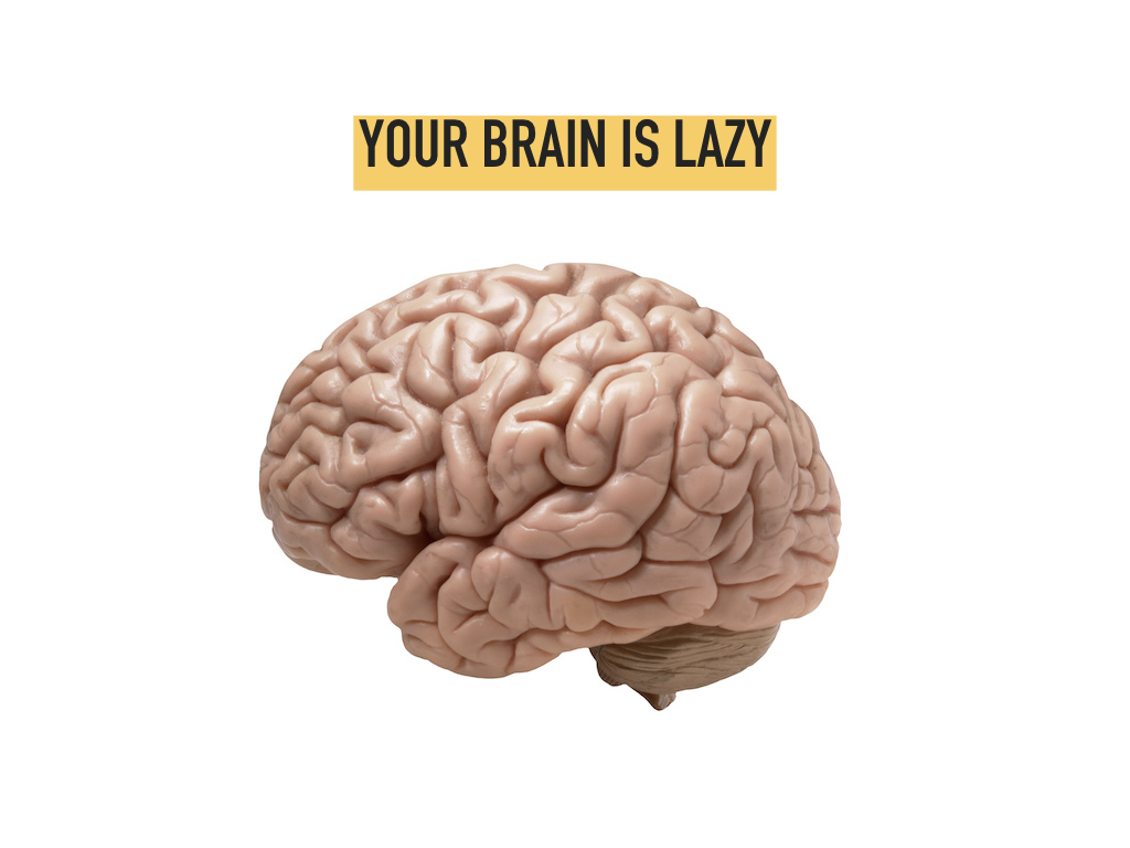
Your brain has two systems, a slow analytical side and a quick, instinctive “gut” side. For the most part, the instinctual side is lazy, conserving its energy for the “pounce”. It doesn’t want to think or stop and read, it wants shortcuts, assumptions, and skimming. It is this part of the brain that design speaks directly to.
To communicate with this part of your brain, design uses constructs such as motion, structure and even emotion, all without using a single word. Design is not just “what you like”, it is a language that is speaking to your instincts.
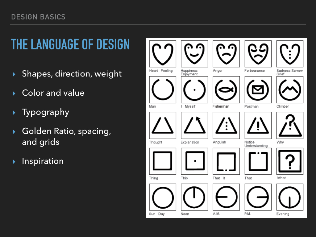
Look at the chart below. Can you guess what these symbols mean?
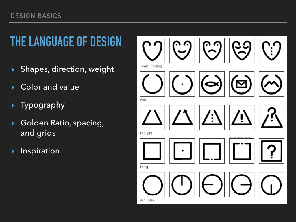
Some of these concepts maybe cultural, but most are pretty easy to guess.
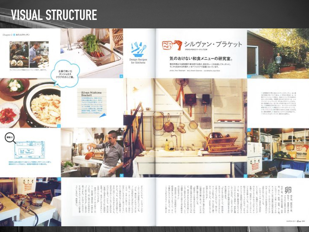
Let’s try another example, this one is in Japanese. Assuming you don’t know how to read Japanese, what can you tell me about this layout? Where is the title? What is it about (try and be specific). What does a callout look like? Where does the text begin?
More importantly, how do you know these things?
What gets the brains attention?
In the next slides we will look at the language of design and how we can use it to direct our users to the more import parts of our interfaces. Let’s start with Distance.
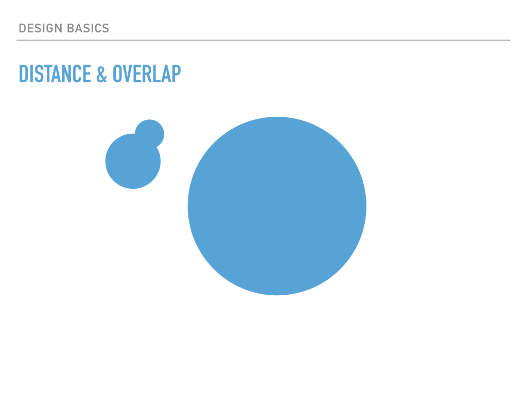
The slide you are looking at is flat. It’s two dimensional. But, can you tell me which object is in front? If you were to analyze it, probably not, but if you were to make a snap decision, you would probably guess the larger items were closer and therefore in front. Which of those items would your lazy brain care about? Well, if they were baseballs coming for your head, probably the closer one would get your attention. In general, things that are larger on the page and in front get more attention.
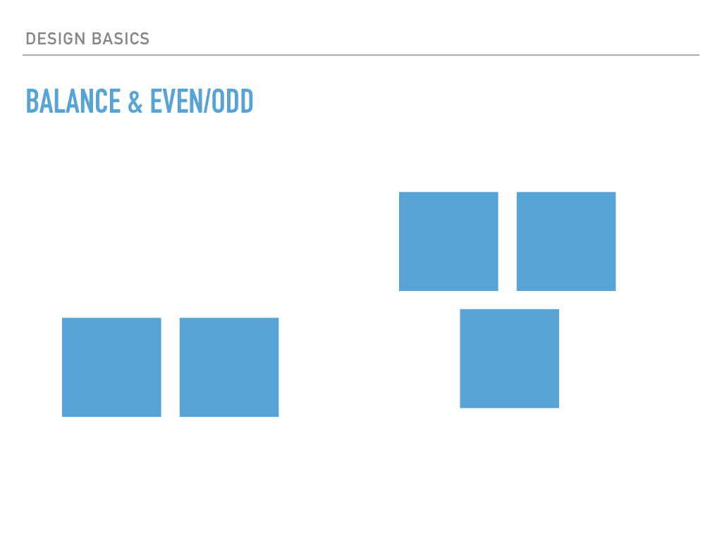
What about balance? of these two sets, which is more interesting? Most people would say the one on the right is, but why? The two even blocks on the left are stable. They’re not going anywhere; the brain can relax. The three blocks on the left however not quite right. If they were cement, they wouldn’t stay in that formation for very long. The blocks on the right gain attention from the brain because a piece is missing and something may happen. As far as our lazy brain is concerned, odd things are more interesting than even.
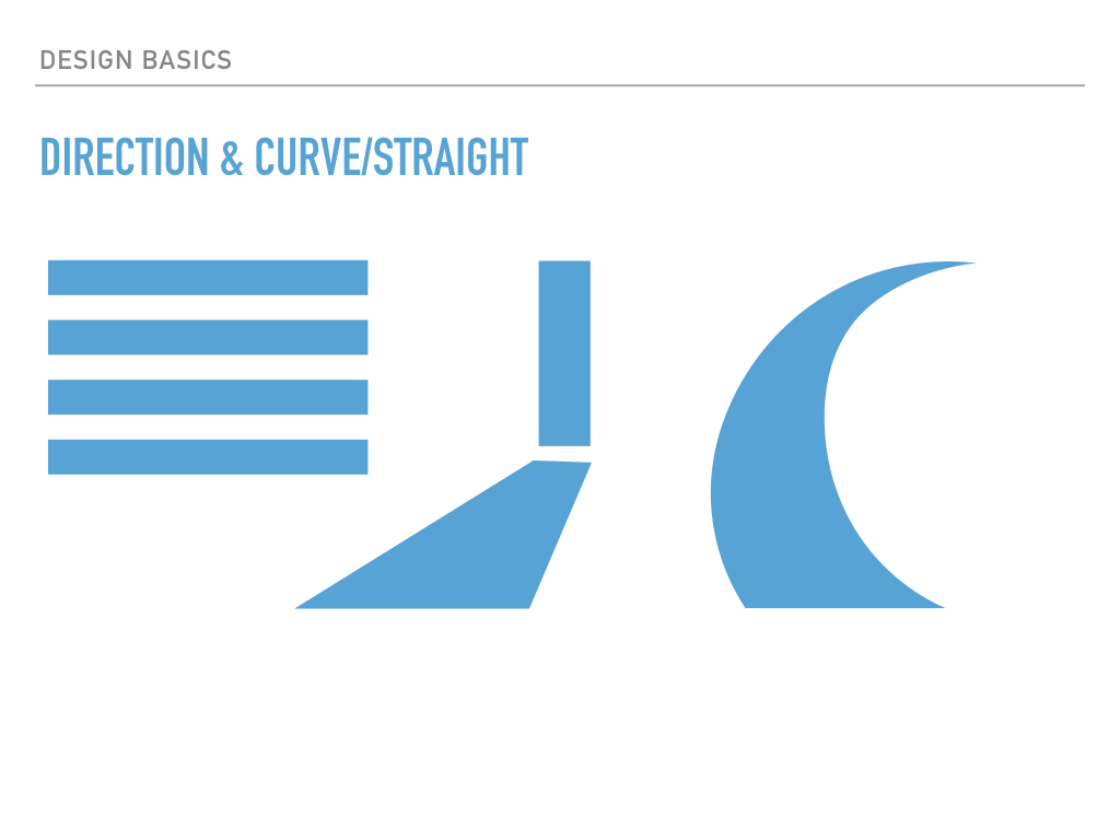
A similar thing happens with curved shapes instead over flat. The brain expects motion and gives those objects more attention.
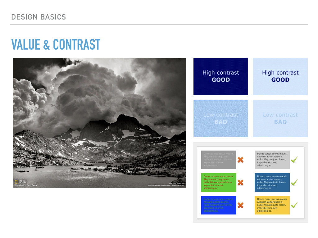
Value and contrast can also be used to focus the lazy brain. For the most part, easy to ready contrast is the goal for text, especially when it comes to text and 508 compliance. However, used sparingly, high and low contrasts can help structure your message.
Ansel Adams was a master manipulator of contrast. When I was young, I thought he was so “lucky” to find such beautiful spots and snap a photo at the right moment. In fact, he spent hours in the darkroom manipulating the balance in contrast to guide your eye. What path do you think your eye is taking across this photo? What do you think makes that happen (be specific)?
Composition
We’ve seen a few examples of how to distinguish and separate ideas use the design language, now let’s look at how to bring ideas together using color and composition.
Color is one of the hardest design constructs to master. Most people, including “pre-art school” me, think about color in terms of what they “like” or based on the order of the rainbow. However, color has a complex structure, and all colors were not created equal. On the right you see color systems called color harmonies. One you might recognize from elementary school is complementary colors, or colors that are opposite each other on the color wheel. But do you know what a split complementary color is? Did you know that artists and designers use these color harmonies to create cohesive work? It’s what gives their work a polished look. However, without a single color theory course, you too can have a polished look. There are sites such as Colourlouvers.com and Adobe’s Kuler.com that are collections of color palettes to make working with color a breeze.
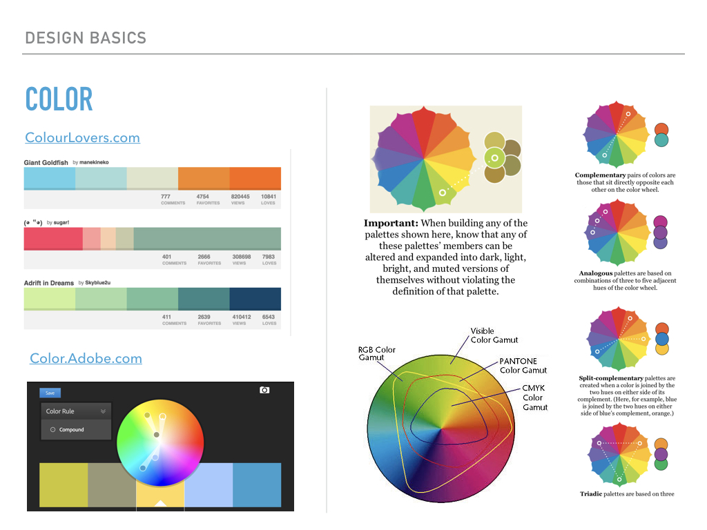
The second thing developers need to know about color is that not every color can be represented by every device…but that is changing every day! In the bottom of the middle of the slide you see an illustration of several color gamut, or the range of colors different devices can display color. You may notice that the color you can display on your screen is much larger than what you can get off your printer, and the color your eye can capture is even larger.
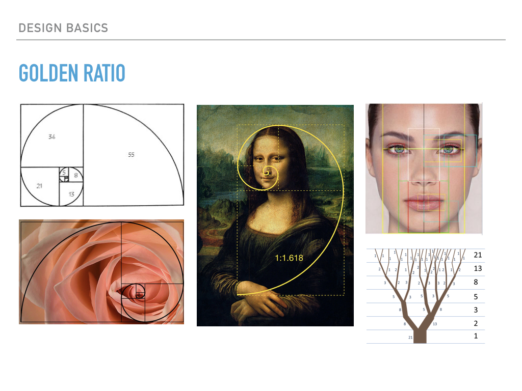
The Golden Ratio is a pretty interesting phenomenon. It can be found everywhere in nature and artist use it to create natural looking compositions. For the most part, developers don’t use this construct…with one really important exception. You will notice that the Fibonacci Sequence is part of the Golden Ratio, and though this may not affect the design decisions you make in your development, it is a good reminder that art and computer science are not that different.
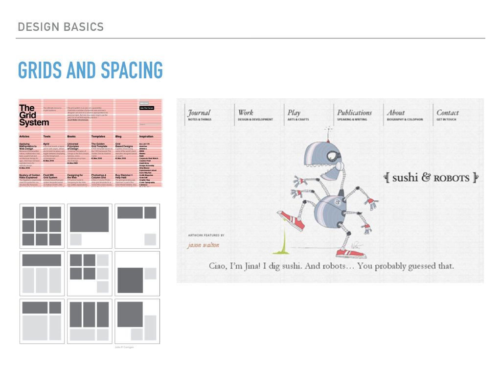
And speaking of compositions, did you know that most designers use a grid system to create those engaging layouts you see in magazines like the Japanese layout we saw earlier? Grid systems are not just for responsiveness. As we saw earlier, a well-structured layout can help you understand the flow of the document without ever reading a single word.
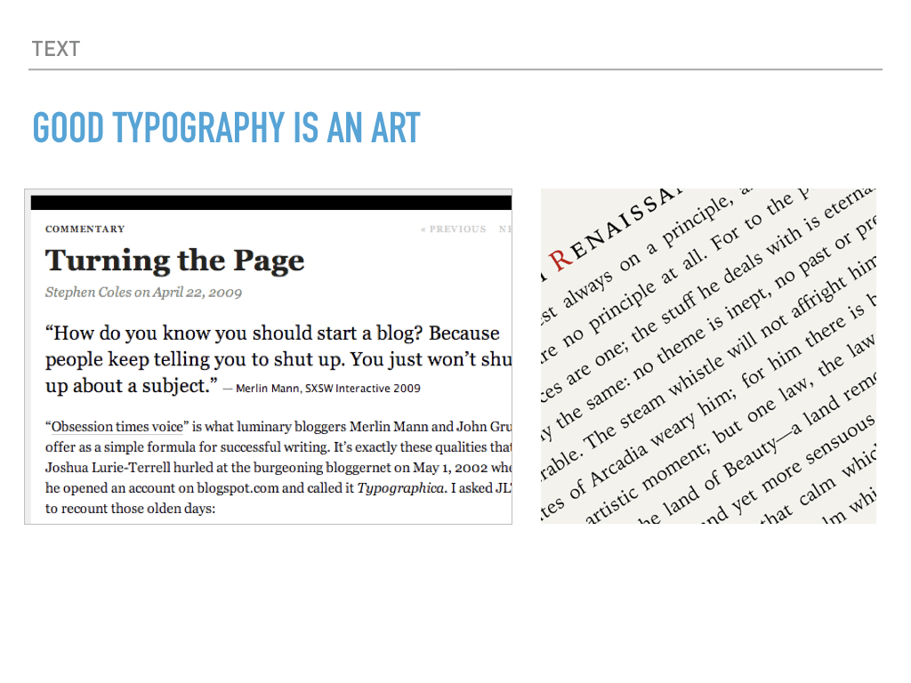
Finally, let’s take a look at good typography. It’s an artform in itself. Think about all the ways we talked about to use design to separate items and bring them back together. What can you tell me about this image? Name all the different ways design is being used in these text-only images?
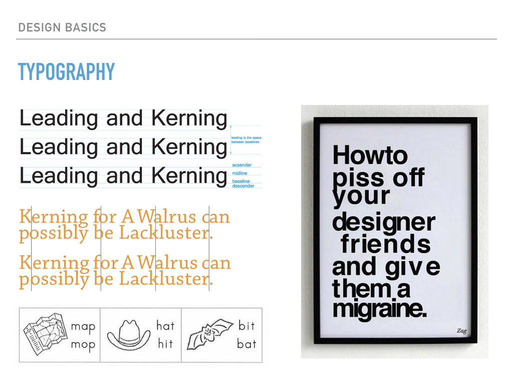
Two things you may not be aware of in typography are Kerning and Leading. Whereas kerning is the space between letters, leading is the space between lines. Do you remember what it was like to learn to read? Do you remember what your books looked like? Did they have more or less leading? Why do you think that was? What happens when you decrease or increase spacing between lines? What do you think your lazy brain would want?
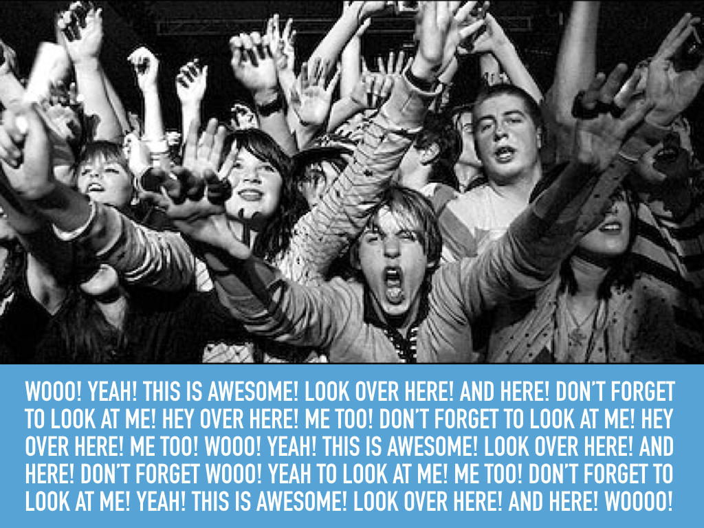
All the tools I have just given you are all you need to practice good design. When you are sitting down to make an interface or even a presentation, think about what parts need to be emphasized and what parts should come first. Should a learn more button be as attention getting as a donate now button? Pick and choose what you want to give attention to. And remember…
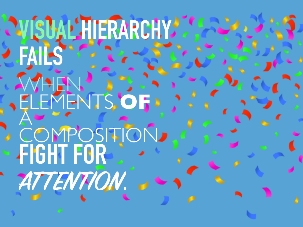
…because if everything has attention, nothing has attention.
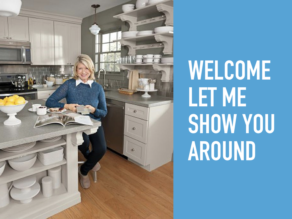
My last tip is to think of you interfaces and presentations as welcoming a guest into your home. It should be focused and organized and have clear steps from beginning to end.
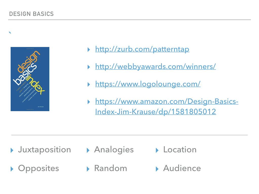
Below are some recommended links to learn more about the concepts we discussed here: