“Color does not add a pleasant quality to design—it reinforces it.” — Pierre Bonnard
Overview
The application of color will make or break a brand, website, brochure, logo, or even what we wear on a date or to a business meeting. The same goes for how we present data. The more complex the data, the more important color becomes in guiding the participant through its visualization. Presenting vast amounts of information in a meaningful and usable manner is increasingly an everyday challenge in many domains. This is especially true when working with health care and life science data. The advancement in sequencing technologies along with their continuously decreasing costs will no doubt result in an even larger surge of incoming data along with an increased need and urgency to easily make sense—and use of this data…earlier.
This article will show how you can improve a user’s experience by apply- ing certain key color theory principles. Other topics to be reviewed here include the application of color theory to data visualizations, the limitations of color use and the different emotions they may convey to your audience. You will also find beneficial tips on selecting the right color palettes to provide a professional look and feel for your next project, while maintaining or even improving your audience’s engagement.
Finally, as a combined example of improved user experience in genomic data visualization, this document will revisit the National Human Genome Research Institute (NHGRI) Genome Wide Association catalog and propose a hybrid semiology approach as an example to increasing usability through the application of color theory and user experience.
Color Limitations
This section on Color Limitations will address some common drawbacks to using color in your projects. We will also examine common emotional interpretations of color in the Emotion and Color section. Finally, the Designing A Color Palette section will present some useful approaches and tools for building a color palette.
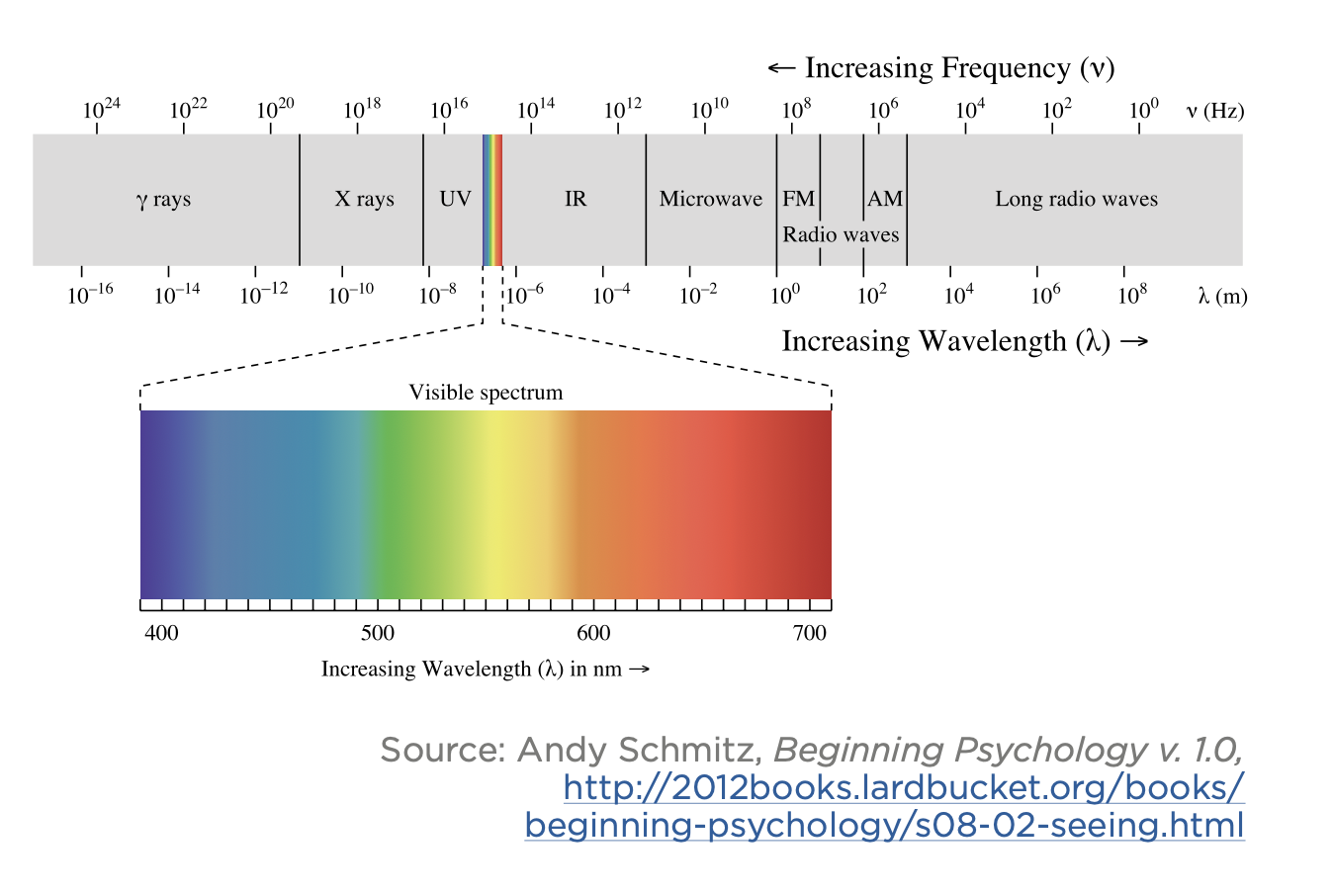
The Visible Spectrum
The visible color spectrum is measured in wavelengths and begins with violet at 380 nm and ends with red around 750 nm. This band makes up the full spectrum of what can be seen by the human eye. However, the human eye and the devices we use to capture and reproduce color have limitations when it comes to rendering this spectrum.
Color Blindness and 508 Compliance
The retina has two types of cells that respond to light, rods and cones. Rods pick up on the intensity of light and give us low light vision. Cones are more specialized and occur in three types, each containing photosensitive proteins that respond to different frequencies of light. When these rods or cones are missing or damaged, an individual is said to suffer from color blindness. Though color blindness is typically classified as a mild disability, it affects many people and can become a severe disadvantage when data is represented with color.
In the DC metro map below, you will see it can be quite difficult for someone with color blindness to follow the subway lines, especially where the Green and Red lines intersect for people with Deuteranopia. To compensate for this, you will notice that the map designers have added labels at the ends of each line, making it possible to identify them without color.
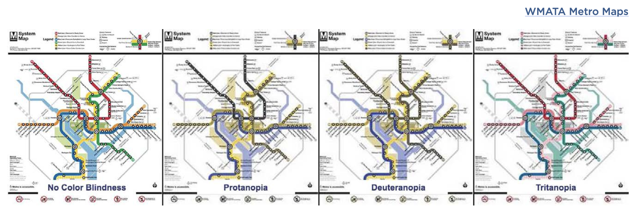
If you are concerned about how your data is perceived by people with color blindness or need to be 508 compliant, you can check it with one of the many free tools listed at the W3C.
Device Color
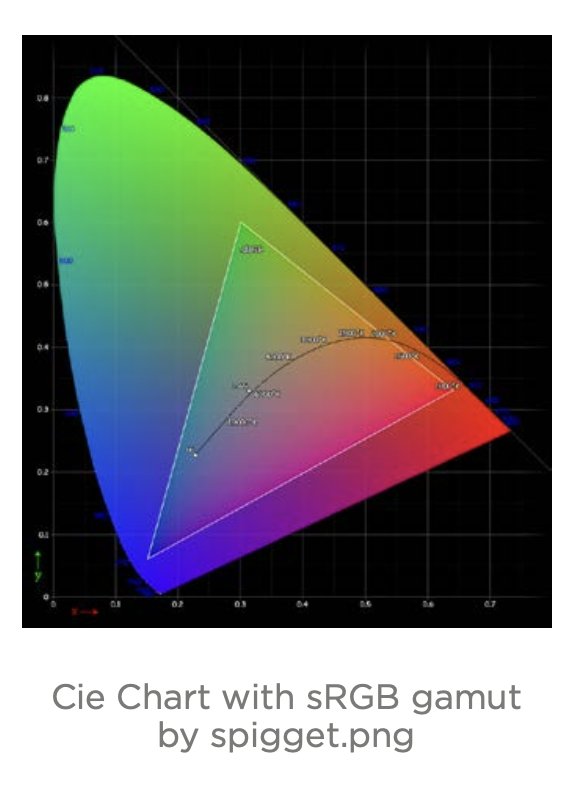
Device color is another limitation to be aware of. Have you ever taken a photo of a beautiful sunset, only to print it out and see that your masterpiece photo is dull and murky? Inherent hardware limitations restrict the range of reproducible colors. Your computer monitor is not able to produce the full color spectrum and printing technology can produceg even less. The equipment we use to capture images, such as scanners and cameras, have their own range of colors they are limited to. In addition to that, all these things, including our eyes, are susceptible to environment, age and the amount of time they have been active that day.
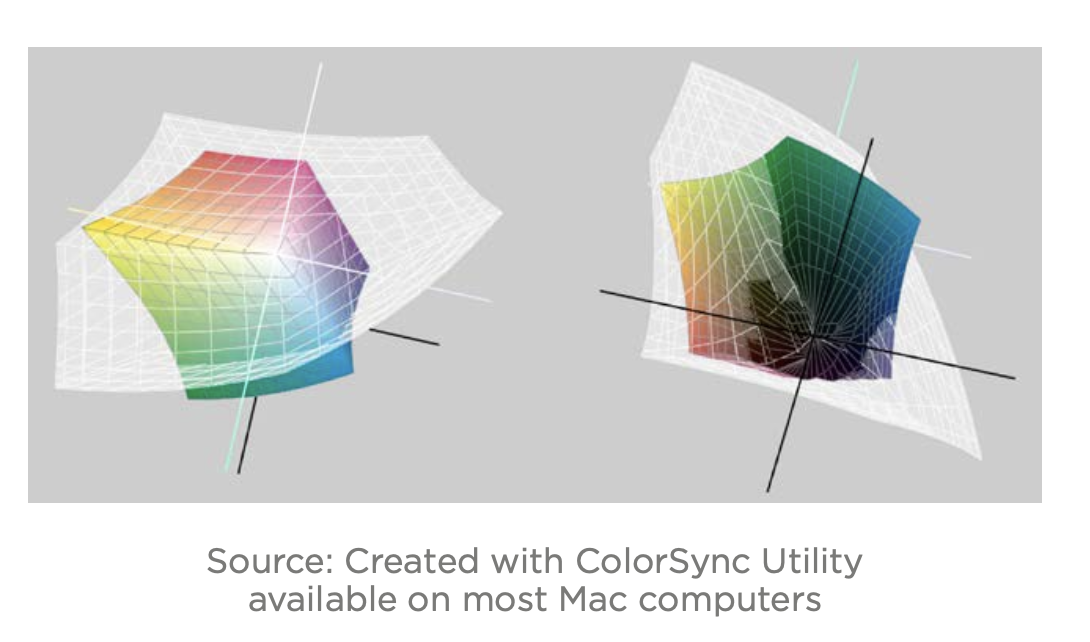
Here are two representations of the ranges, or gamut, of color devices. In the first shape shown below, the rounded outer shape represents the visible spectrum mentioned above; what we can see with our eye. The inner triangle shows device color. As you can see it is quite a bit smaller than the visible spectrum. The second image to the right is more device specific and shows the top and bottom of a 3D color model. The outer shape (white mesh shape) represents the color that a typical LCD monitor can produce.
The inner core (color shape) is what can be produced by a high-end printer. Once again, it is a much smaller, and you will notice that there are some
colors that can be produced in print that cannot be captured on a monitor.
You Can’t Always Trust What You See
One of the most shocking things I learned as an artist is that color has the illusion of energy and motion, and not just in the poetic sense. If you know how to harness this illusion, you can use it to great effect. If not, you can literally repel your viewers and can make text very difficult to read.
Vibrations
Some colors vibrate when put next to other colors. In the chart below, you can see that, not only does it almost “hurt” to look at these colors, the text becomes very difficult to read without looking away. This is not something that you want your audience to experience.
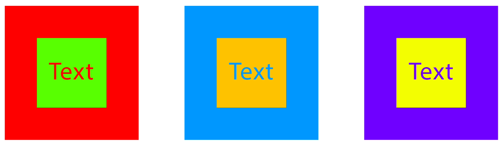
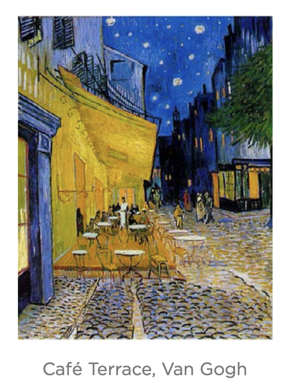 However, this same effect is often used by artists to add energy to their paintings.
Notice how in Van Gogh’s Café Terrace, the artist uses the vibration of orange on the distant blue buildings to make the lights pop. Additionally, the yellow/orange colors
of the cafe push it forward and in front of the taller blue building behind it.
However, this same effect is often used by artists to add energy to their paintings.
Notice how in Van Gogh’s Café Terrace, the artist uses the vibration of orange on the distant blue buildings to make the lights pop. Additionally, the yellow/orange colors
of the cafe push it forward and in front of the taller blue building behind it.
Contrast
Each color has their own value, or level of “greyness.” If the values of two colors are too close, like the example below, then the contrast is too low, with
“weak energy,” and can be difficult for someone with vision problems to see it. Again, there are many free contrast checking tools listed at the W3C.