Tips for Designing a Color Palette
In the first two sections of this book, Color Limitations and Color and Emotions, we looked at some interesting facts about color and some of the context around their meaning. This provides tips for choosing a harmonious color palette, that will bring your designs and graphics together. In the next section, we will look at when and why choosing color to separate your design and graphics is important.
Create Harmonies
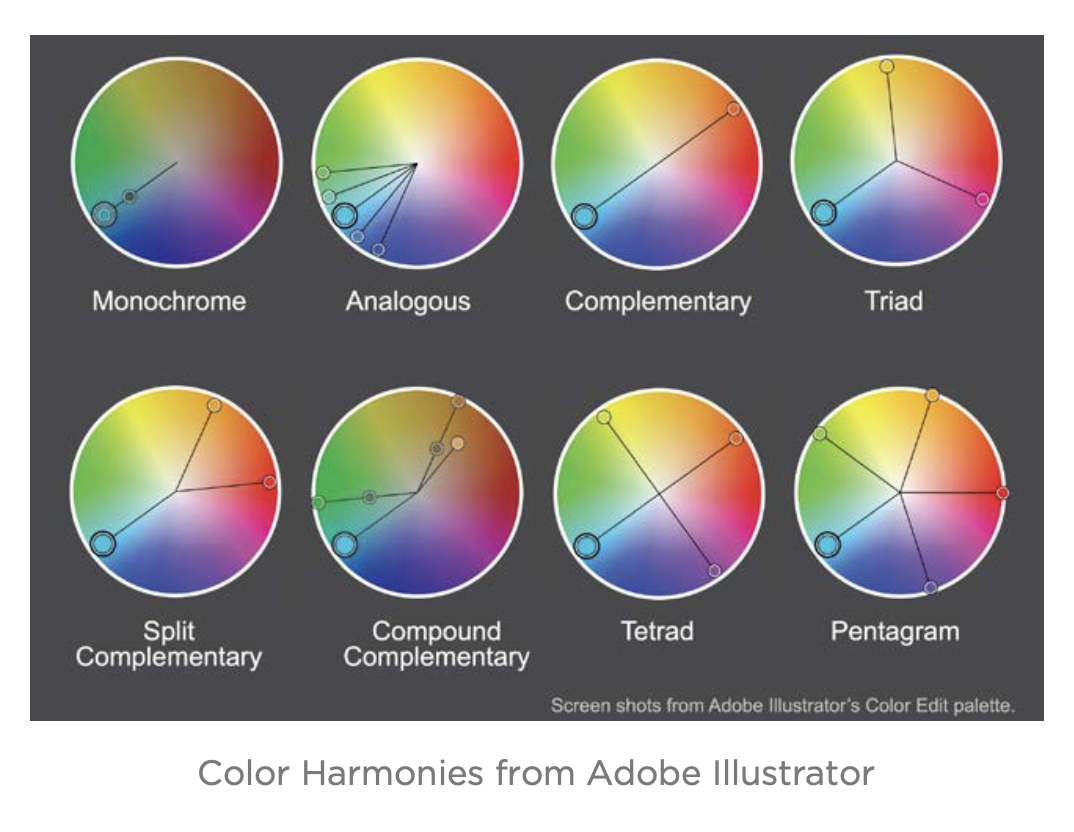
When creating a color palette one option is to create a color harmony. Pick a color, any color. As most of us learned in school, that color has an opposite or complementary color. Red and green, blue and orange, yellow and purple are all complements of each other. These colors are opposite each other on a color wheel. But did you know there are other patterns or color harmonies? Color Tiger’s “Color Harmonies — basic techniques for creating color schemes” article does a nice job of explaining the different harmonies, and tools like their Color Impact 4, Adobe’s Kuler, and Colourlovers’ Copaso all help you create color harmonies.
Color Harmonies from Adobe Illustrator
Use Tints, Shades, Saturation, Warm and Cool Instead of Additional Colors Often, when choosing colors for a design or graphic, we are sometimes too quick to jump to a new hue, giving our work a rainbow effect. Instead, consider adjusting a limited color palette of two to three colors by adding white, known as creating tints; adding black, known as creating shades; and adding greys, known as desaturation. Additionally, you can adjust your colors by moving your colors left or right on the color wheel, which is know as making your colors warmer or cooler. This can be seen in the analogous color harmony above where the main color is in the middle; the warmer colors, or colors that move more toward the reds and oranges, are to its right; and the cooler colors, or colors that move toward blues and greens are to its left.
Remember to Balance Your Color with Different Weights
When designing a color palette, it is good to remember that you should not treat your colors equally.
Remember the typography rule:
“WHEN EVERYTHING IS EMPHASIZED, NOTHING IS EMPHASIZED.”
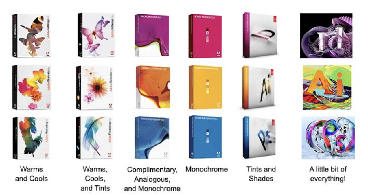
The same applies in color. Make one color your primary color and use the rest to accentuate that color. When in doubt, you can always use the 60-30-10 rule, mentioned in this article by HGTV on interior decorating. Companies such as Ubuntu even use different amounts of the same color palette to communicate differences of emphasis in content, as well as different sub-brands as shown in there branding here. When you are dealing with many brands such as the case with Adobe you may need to expand your palette beyond a few colors into the rainbow effect, but the color balance principles still apply.
Notice how Adobe’s graphic design-based products, Illustrator and InDesign, are analogous and are pink and orange; the web products, Dreamweaver and Muse, are cool and warm versions of green; the video products, After Effects and PremierPro are a saturated and desaturated version of two violets that are very close; and Photoshop, Adobe’s flagship photography product, is blue. Even though the current branding material has a lot going on you can still identify the key color in the image.
“Good Artists Borrow, Great Artists Steal.” —Pablo Picasso
Why reinvent the color wheel? Good color palettes come from many sources such as interior design, fashion, or nature. Or, if you are using a photographic image with your graphic or page, why not pull your colors from there? Use an eyedropper tool like ColorPick and click around to pick up your favorite colors. In addition to the great tools already mentioned for creating palettes, try browsing those same sites for palettes created by other colorphiles.